My Role: UX Designer
- Visual Design & Layout
- Mockups, Prototypes
- User Testing
Tools used:
- Figma
- FigJam
- Lyssna (UsabilityHub)
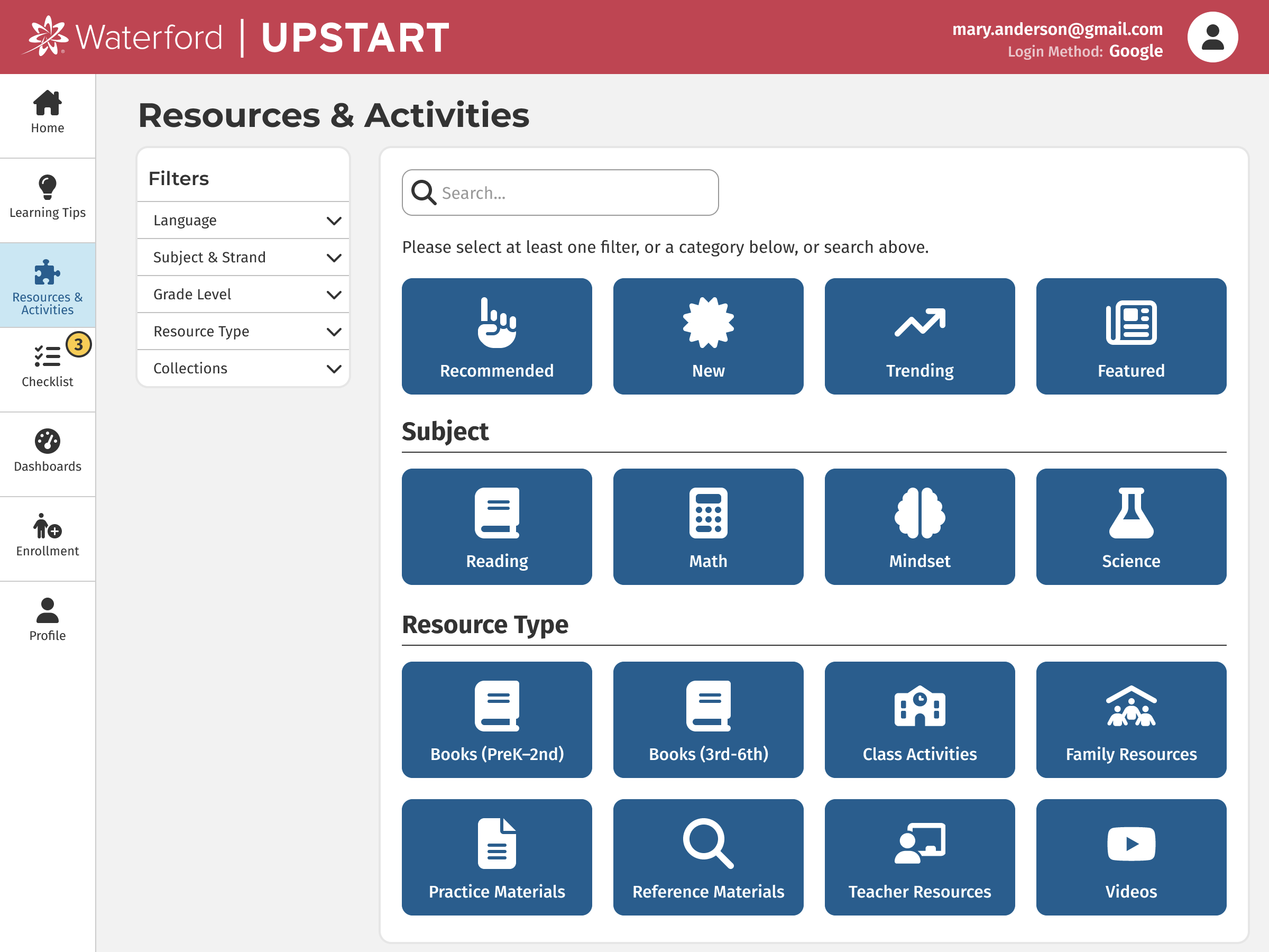
Waterford Upstart is an at-home early learning program to help get kids ready for Kindergarten. It teaches foundational skills in reading, math and science. This website is intended for parents and caregivers to give them the tools they need to get involved in their child’s education. The child logs into a separate page (see Child Experience at the bottom of this page) to do their daily lessons and the parent can then see how the child is progressing from this site. It also provides resources and tips to help the caregiver engage specifically in what their child is learning.
The icons were sourced from Font Awesome. I designed the rest of this mobile-responsive website.
Below you will find screenshots of the final product and then a detailed view into my research and process. You can use these links to skip straight to a section.
Mobile Screenshots
Desktop Screenshots
Research & Process
I worked alongside the Product Manager and Product Owner to learn how our customers used the current site. We conducted user interviews with parents and caregivers of young children. We also sent out a survey with a few general questions to discover where the most common pain points were. Additionally, we conducted ongoing meetings with the team of coaches at Waterford that supports these families.
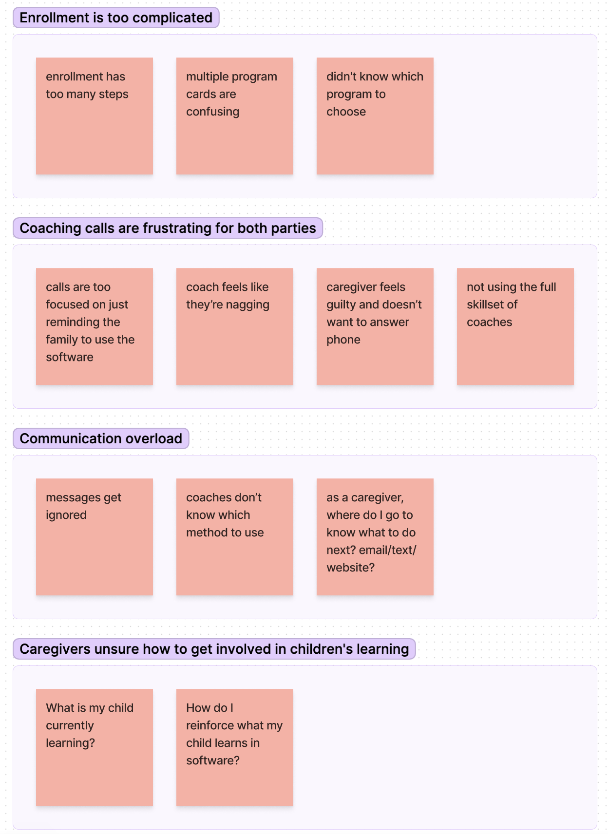
We then grouped those responses based on themes. Here are the top 4:
- Enrollment is too complicated
- Coaching calls are frustrating for both parties
- Communication overload
- Caregivers are unsure how to get involved in their child's learning
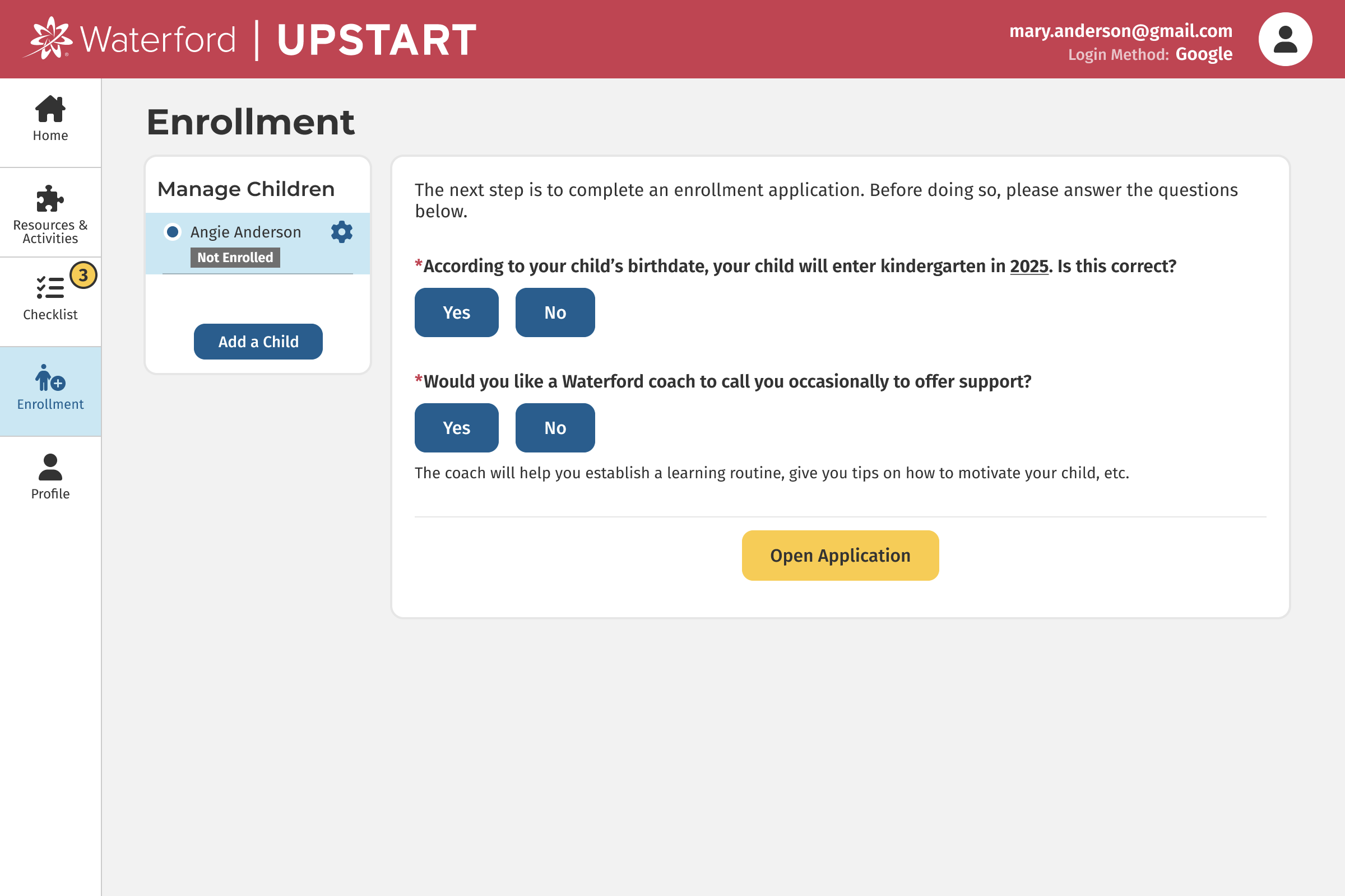
Problem #1: Enrollment is too complicated
Enrollment is one of our first touchpoints with customers, and we didn't want to lose users on their first impression. So we decided to tackle the enrollment process first.
Brainstorming and User Testing
In our interviews and survey, many users said things like:
- "enrollment has too many steps"
- "multiple program cards are confusing"
- "didn't know which program to choose"
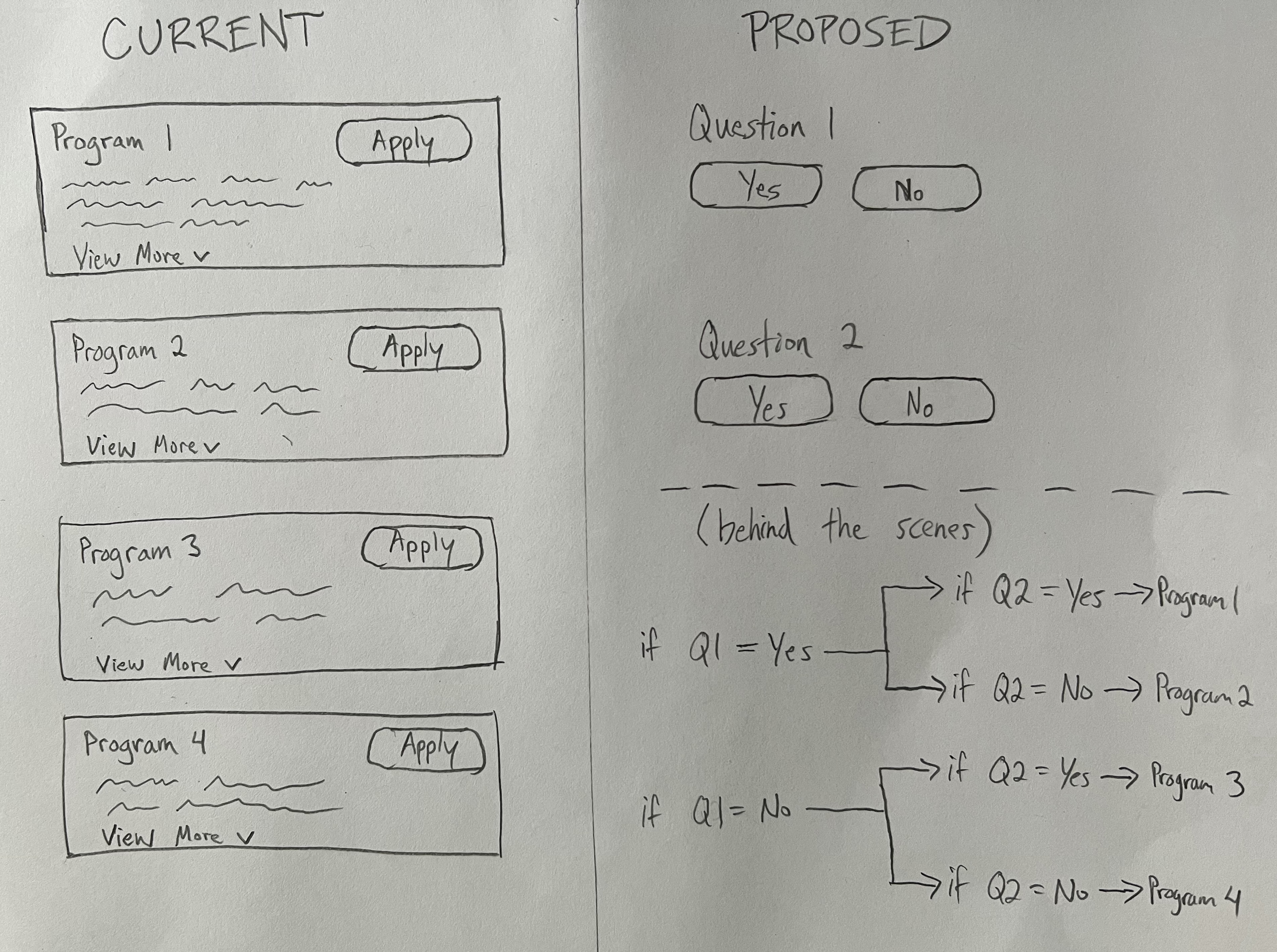
As we researched ideas and solutions, we were inspired by Turbo Tax, Typeform and other sites that break down complicated forms into simple yes/no questions. We brainstormed how that could work for enrollment and how it might potentially simplify the experience for users.
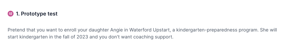
We decided to test that out. I created a mockup in Figma, and we sent out an A/B test through Lyssna (UsabilityHub).
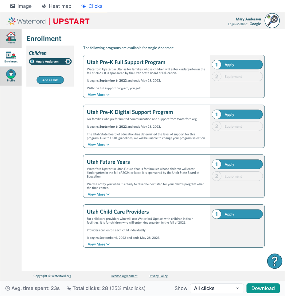
Here is the scenario presented to users:
Users saw one of two different flows for the registration process.
Here is the first option which is how the website previously worked:
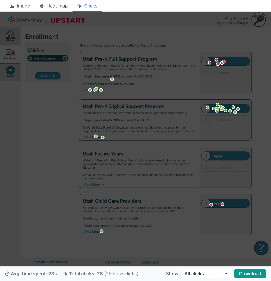
And here you can see the results showing where users clicked:
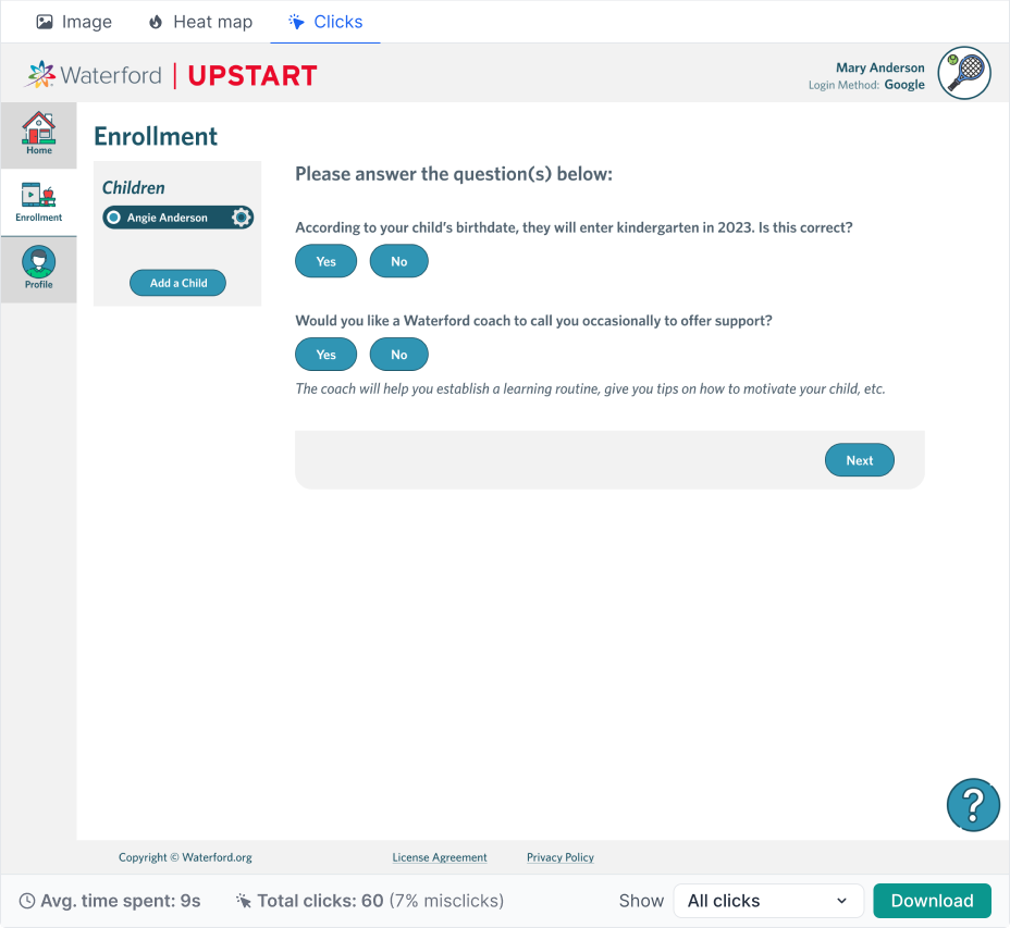
Here is the proposed redesign, where instead of requiring users to read through all the details of each program and decide which one they wanted, we instead posed a few simple yes/no questions and then automatically selected the appropriate program for them based on their preferences.
And here you can see the results:
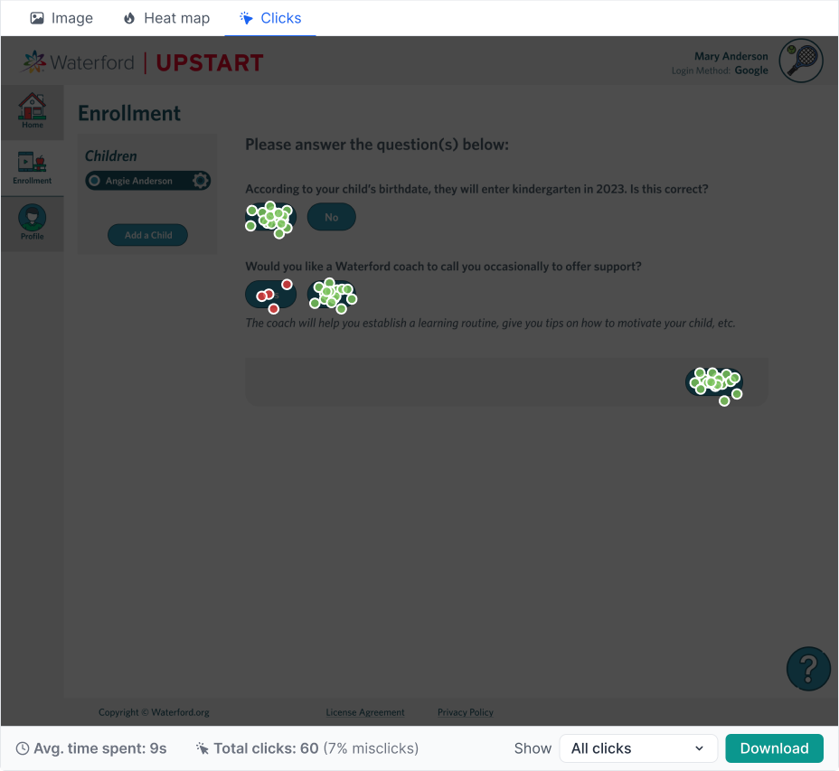
One key insight we gained was that although the redesign required more clicks, it resulted in much greater accuracy and less time to complete. Average time on this page decreased from 23 seconds to 9 seconds, and misclicks went down by 18%.
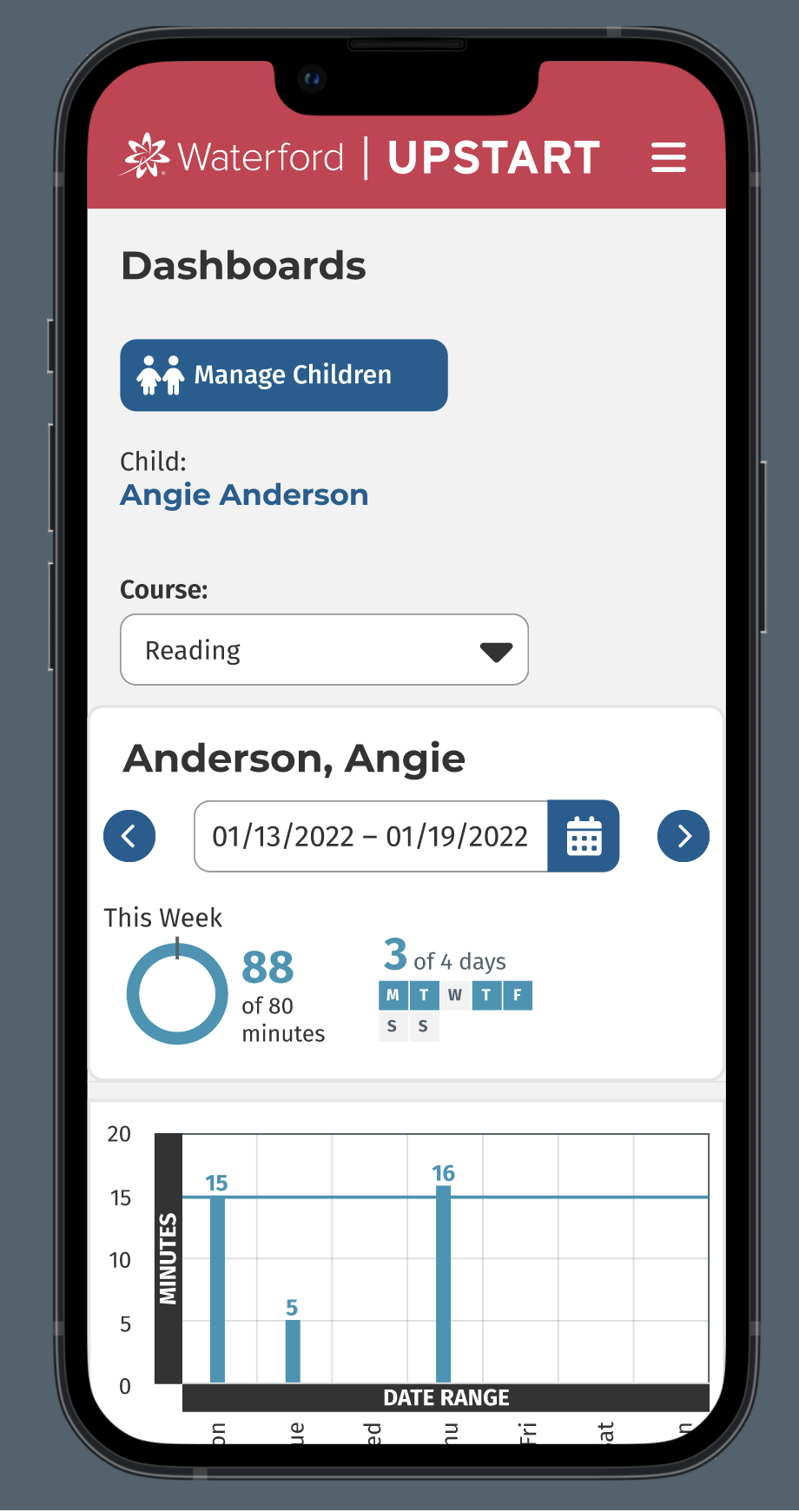
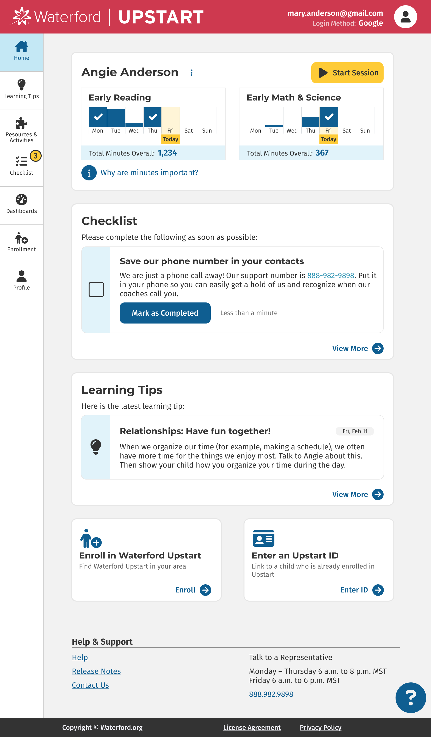
Problem #2: Coaching calls are frustrating for both parties
From our interviews, we learned that our Waterford coaches were primarily calling families to remind them to use the software each day. Daily usage is critical for the children to make gains and be ready for kindergarten. These phone calls were frustrating for both coaches and families: coaches didn’t want to feel like they were nagging the families, and families didn’t want to answer the calls out of guilt if their child wasn’t meeting the usage goal. So we wanted to remove this burden from both parties.
Solution #2
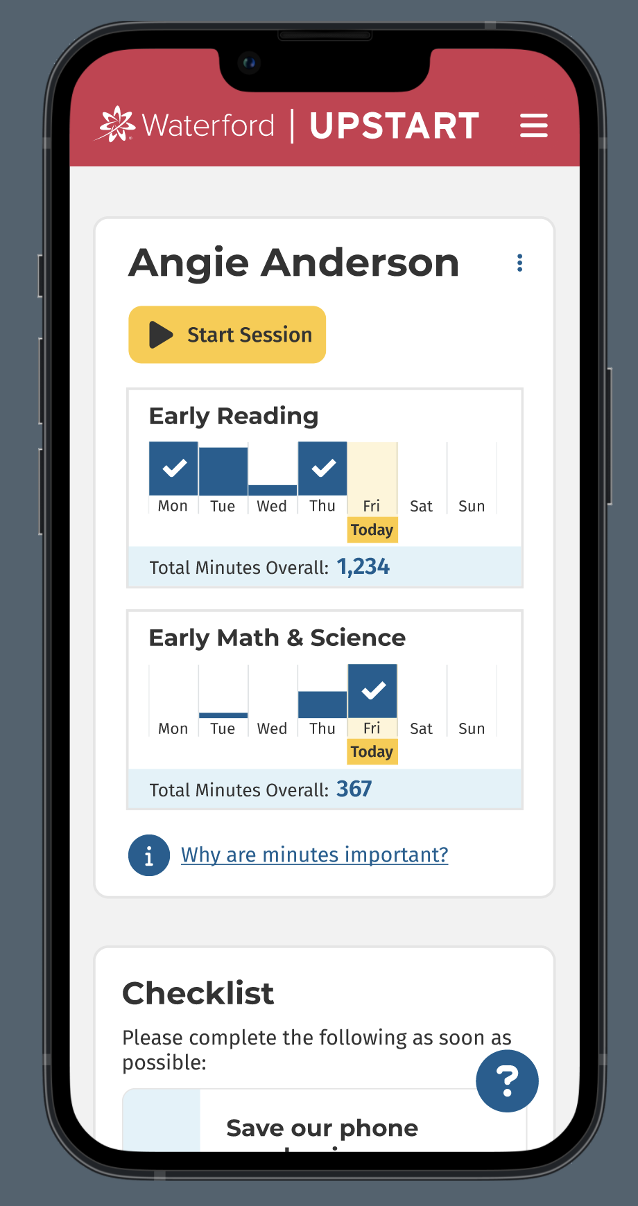
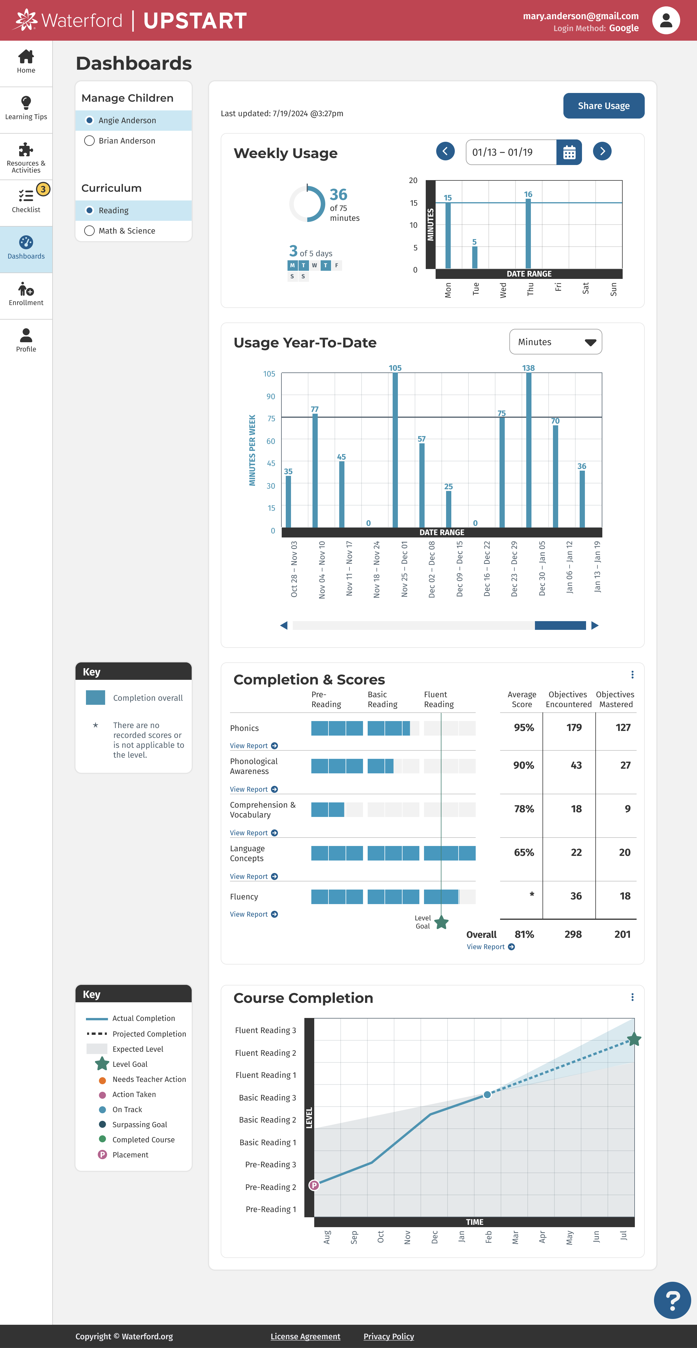
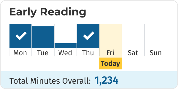
We designed a usage card at the top of the home page to show the child’s minutes in the software each day for the current week. Each day fills up with a bar graph, and when the child reaches their 15 minutes it displays a checkmark. This allows the parent/caregiver to quickly know whether their child has done their learning for the day.
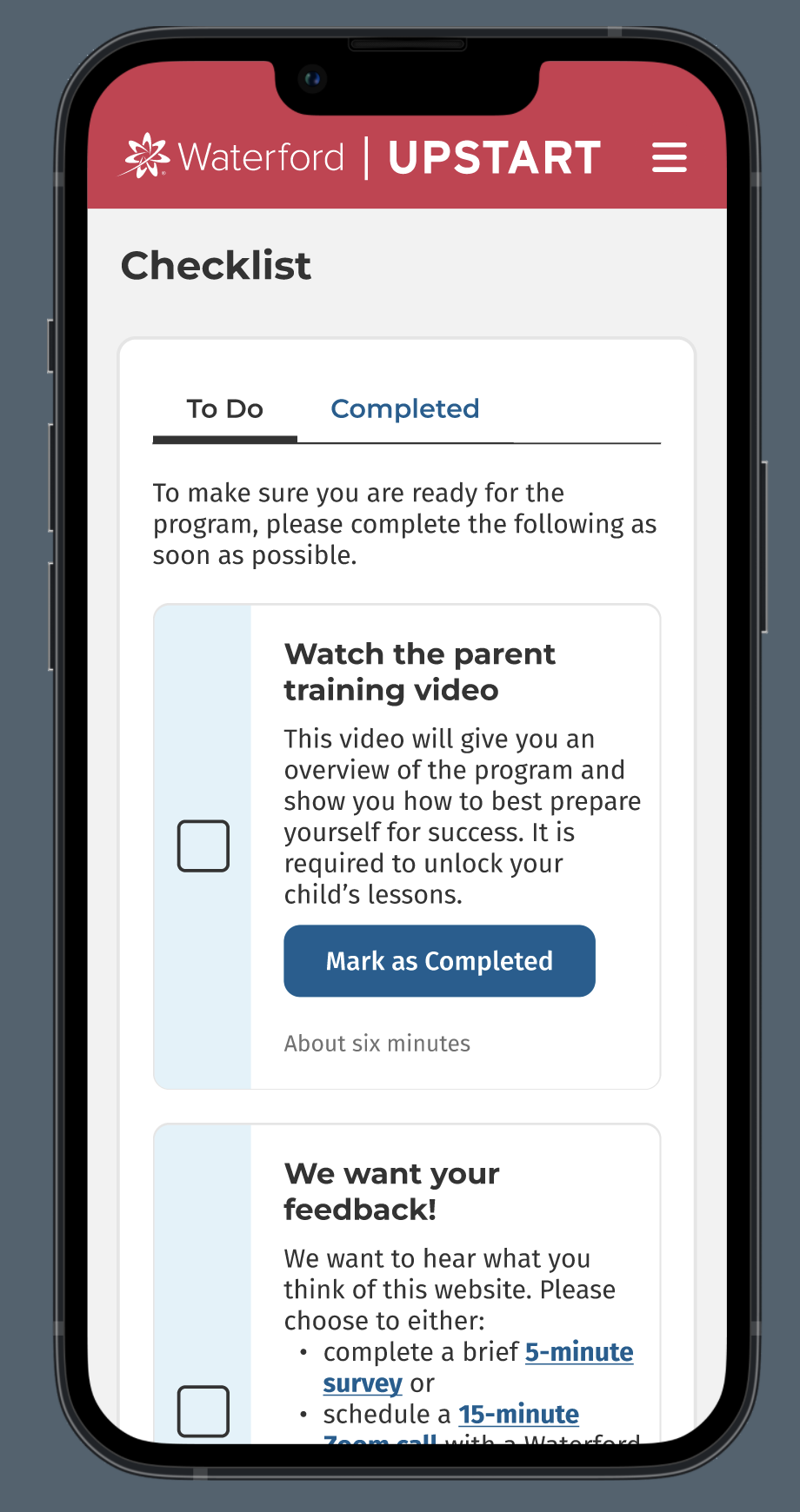
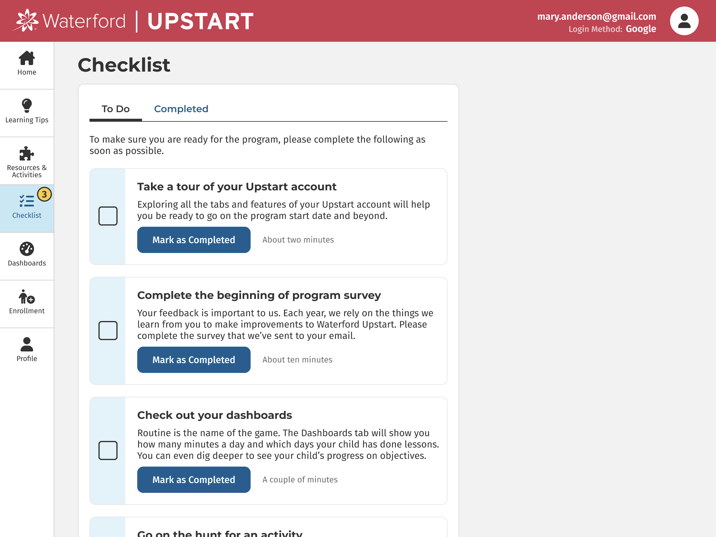
Problem #3: Communication overload
Throughout the program, parents & caregivers need to fill out various forms, watch training videos and attend online events. In the past, coaches sent reminders through emails and text messages. However, this was time-consuming for coaches and many of these messages were ignored due to communication overload.
Solution #3
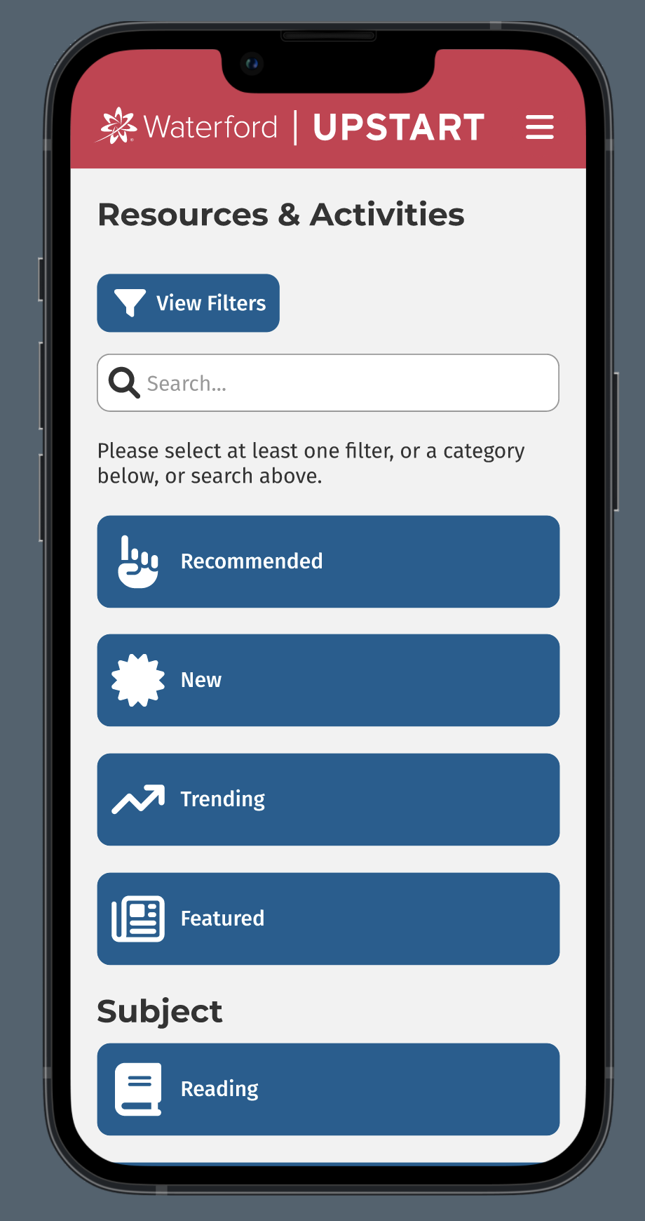
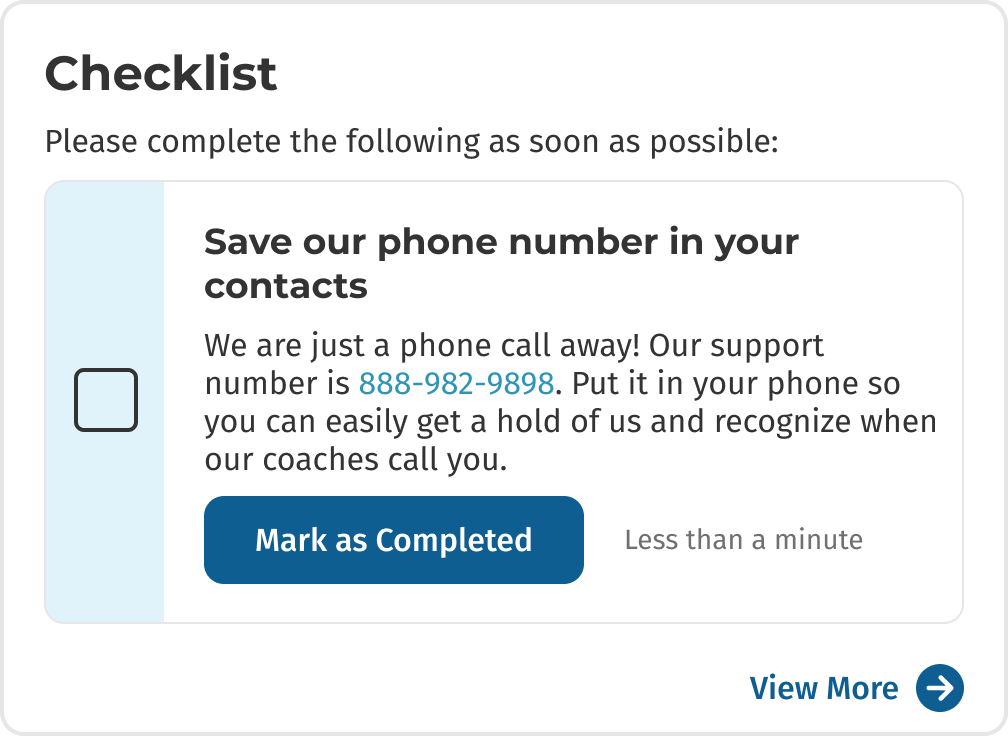
We created a Checklist on the home page where caregivers can quickly see the next task they need to do. We only display one item at a time so they don’t feel overwhelmed, but if desired they can click to view more.
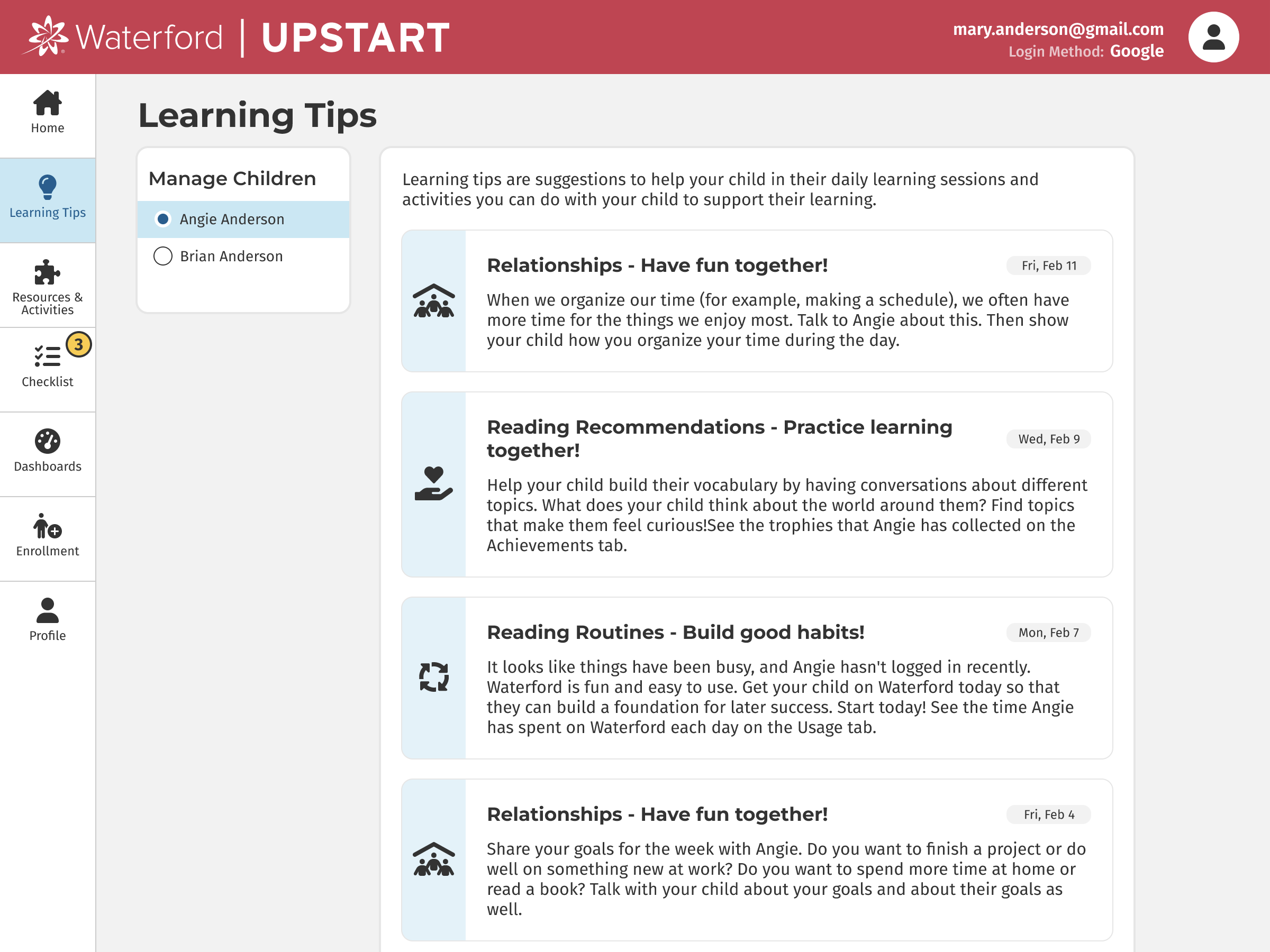
Problem #4: Caregivers are unsure how to get involved in their child's learning
Parents & caregivers want to be involved in their child’s education. They care deeply about their children and want them to have a great start. But they sometimes don’t know exactly how to get involved or what to talk with their child about.
Solution #4
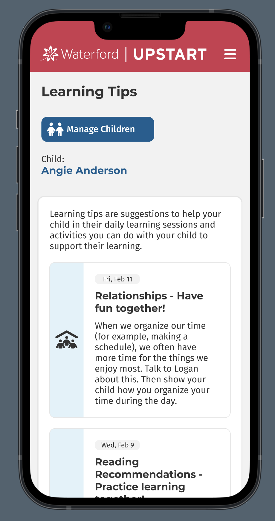
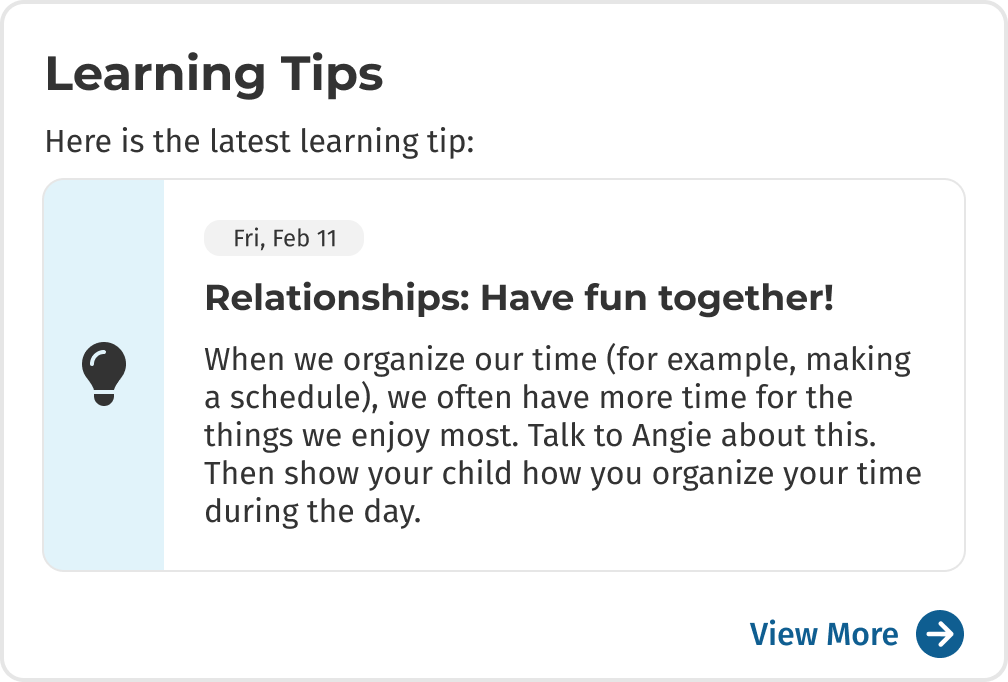
We created a section for Learning Tips. These tips are sent out three times a week. The latest one appears prominently on the home page, and more can be found on a separate tab.
These are just a few of the problems that we discovered and the solutions we designed for the home page of Upstart. The result is simple messaging for parents & caregivers: login to the site for 5 minutes each day and check these three sections on the home page. As a result, our coaches have been able to turn their focus into deeper matters, such as how parents can motivate their children and make their daily conversations with them more specific and engaging.
To see the full site, check out the Figma prototypes at the top of this page.
Child Experience
I designed this landing page for children using Upstart. They select from their two courses (Reading or Math & Science). They can also complete individual assignments, look at their postcard collection or select freeplay activities. I designed the postcard concept to motivate children. When they complete their daily lessons each day they receive a postcard as an award. These postcards are collected in a gallery that they can view anytime. The art for the postcards was illustrated by our talented team of artists and animators at Waterford.